# Panels
The panels component is used to display a set of quick access links that relate to a topic.
The easiest way to create a new panels component is to duplicate an existing one. However, if you need to create the component from scratch, follow the directions below.
# Settings
This component is created in widgetkit. To create a new details component go to "Components" > "Widgetkit" and select "new". The follow these steps:
- Use the "Grid" widgetkit
- Add a title and description for each item
- Add a link for each item
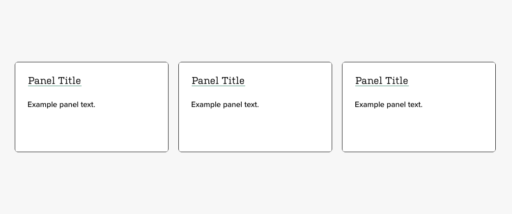
- It is recommended to use either 3 or 6 items to create a 3 column grid with either 1 or 2 rows
- Go to Settings
In "Layout" use these settings
- Behavior: Match Height
- Gutter: Default
- Phone portrait: 1
- Phone landscape: Inherit
- Tablet: 2
- Desktop: 3
- Large screens: Inherit
- Panel: "Box Primary"
- Link entire panel if link exists: Yes
- Animation: None
None of the settings in the media tab should matter since this component does not use media.
In "Content" use these settings
- Show title: Yes
- Show content: Yes
- Show social buttons: No
- Title size: H4
- Alignment: Left
- Show link: No
- Show badge: No
In "General" use these settings
- Open all links in a new window: No
- HTML Class:
wk-panels