# Buttons
# Usage
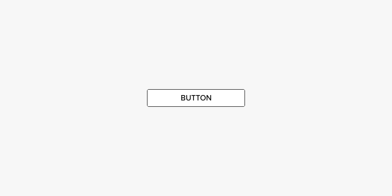
A Button is the most common form of a Call To Action (CTA). These are powerful components that grab the attention of the user and ask them to perform an action. These should be used sparingly and only when necessary.
# Markup
<a class="btn" href="LINK URL">
  Button Text
</a>
# Themes & Modifiers
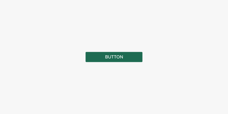
# Primary
Adding the btn-primary class will turn the button into a primary button with solid UAB green styling. Note that the hover and disabled states are the same for all buttons, regardless of theme.
<a class="btn btn-primary" href="LINK URL">
  Button Text
</a>
# States
Buttons can have two states, hover/focused and disabled. The hover/focused state is built into the component and will work automatically.
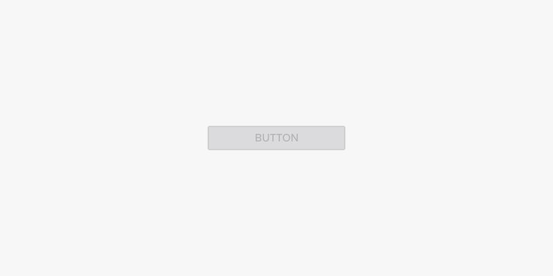
# Disabled
To disable a button, add the disabled attribute to the button's HTML element. Disabled buttons do not accept click events and have no hover styles or alternate states.
<a class="btn" href="LINK URL" disabled>
  Button Text
</a>
← Blockquotes Callouts →