# Grid
The easiest way to create a grid, or align items in columns is to create a new widgetkit grid item. There are some instances where this is overkill, such as setting two buttons side by side. For these purposes, a robust grid system has been included in the website's CSS. This grid system is heavily inspired by Bulma, but the implementation is slightly different.
# Basics
Add a grid container and as many grid_items as needed. To allow a grid to break into multiple lines, add the is-multiline class to the grid container.
You can use one of the following classes on each grid_item to control how much space the item takes up on it's row.
- is-full
- is-three-fourths
- is-two-thirds
- is-half
- is-one-third
- is-one-fourth
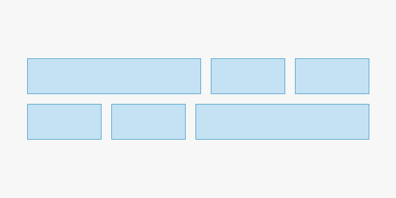
<div class="grid">
  <div class="grid_item is-half">is-half</div>
  <div class="grid_item">Auto</div>
  <div class="grid_item">Auto</div>
</div>
# Breakpoints
By default, the grid will not function on small screens. To enable the grid on small screens, add the is-mobile class to the grid container. All of the grid_item size classes can be suffixed with -sm, -md, or -lg to determine how much space the item will take up on small, medium, and large screens.
← Google Sheets Images →