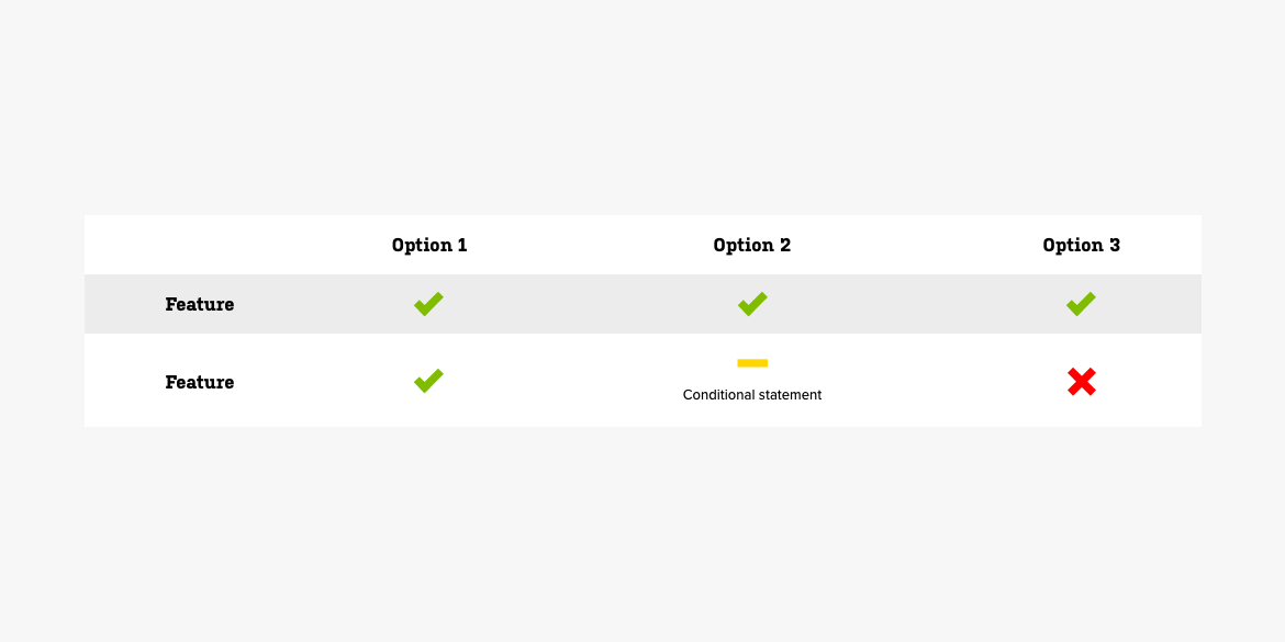
# Comparison Table

# Usage
A comparison table is used to display how a number of options compare and contrast to one another. These are typically in the form of option/feature tables where cells answer the question "Does this option have that feature".
# Markup
The comparison table shares basic markup with tables and can take advantage of table themes. The only class required to make a comparison table is comparison-table on the table element. However the below markup is recommended for the best appearance.
<table class="comparison-table table-striped borderless u-txt-c">
For cells that confrim that a certain option has a specific feature, the markup would look like this:
<td><em class="icon-ok" aria-label="Yes"> </em></td>
The icon-ok class adds the checkmark icon and greeen color. The aria-label is used to tell screen readers what the icon means, and the exists to hold the space in the html element. Without the non breaking space, the html element would be empty and Joomla would remove it.
For cells that confirm that a certain option does NOT have a specific feature the markup would look like this:
<td><em class="icon-remove" aria-label="No"> </em></td>
Here the icon-remove class adds the x icon and red color.
For cells that indicate that a certain option may include a specific feature under certain circumstances, the markup would look like this:
<td><em class="icon-minus-sign" aria-label="Yes, but" data-mce-empty="1"> </em><br /><small>Condition</small></td>
Here the icon-minus-sign adds the minus icon and yellow color. Notice how this cell also includes a <br/> break element and <small> text. This is where the condition description would go.