# Hero
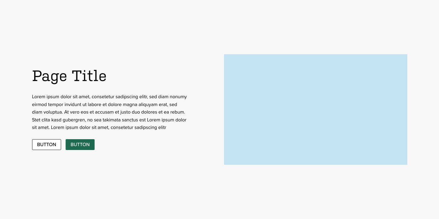
The hero component is a special component that should only be used at the top of pages without sidebars. This component serves the purpose of grabbing attention, providing an introduction to the page, and giving a couple of calls to action.
The easiest way to create a new hero component is to duplicate an existing one. However, if you need to create the component from scratch, follow the directions below.
# Creating a hero from scratch
This component is created in widgetkit. To create a new details component go to "Components" > "Widgetkit" and select "new". The follow these steps:
- Use the "Grid Stack" widgetkit
- Add each item with a title and image
- For the content section, use this framework:
<p>DESCRIPTION</p>
<div class="grid">
  <div class="grid_item">
    <a href="LINK URL" class="btn u-full btn-primary">LINK TITLE</a>
  </div>
  <div class="grid_item">
    <a href="LINK URL" class="btn u-full btn-primary">LINK TITLE</a>
  </div>
</div>
In "Layout" use these settings
- Media Width: 60%
- Media Alignment: Right
- Breakpoint: Tablet
- Alternate media alignment: No
- Show the grid gutter: Yes
- Vertical Gutter: Same as horizontal
- Show horizontal divider: No
- Add whitespace to content: No
- Center content vertically: Yes
- Animation media: None
- Animation content: None
In "Media" use these settings
- Show media: Yes
- Image width: Auto
- Image height: Auto
- Border: None
- Overlay: None
- Animation: None
In "Content" use these settings
- Show title: Yes
- Show content: Yes
- Show social buttons: No
- Title size: H1
- Alignment: Left
- Show link: No
- Show badge: No
In "General" use these settings
- Link target: No
- HTML Class:
wk-hero