# Gallery
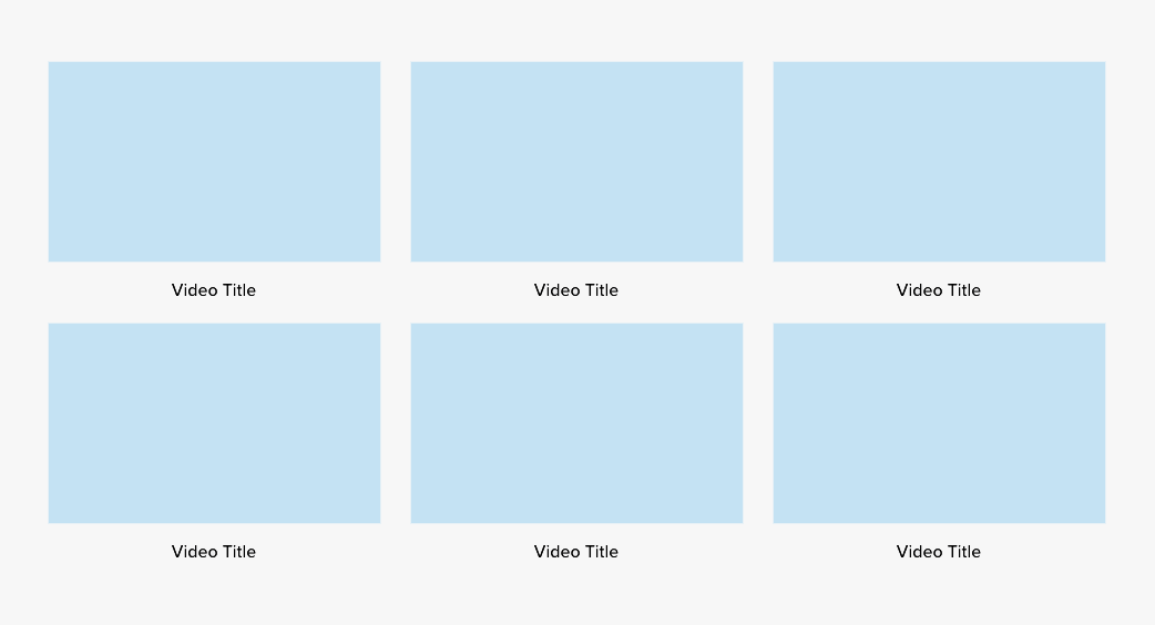
The gallery component is used to display several videos or images. They are displayed in three columns with variable rows.
The easiest way to create a new gallery component is to duplicate an existing one. However, if you need to create the component from scratch, follow the directions below.
# Settings
This component is created in widgetkit. To create a new details component go to "Components" > "Widgetkit" and select "new". The follow these steps:
- Use the "Gallery" widgetkit
- Add each item with a thumbnail of the image or video
- Add a paragraph in the "Content" section with the title of the image or video
- For a video gallery, link to the video in the link field
- Go to Settings
In "Layout" use these settings
- Behavior: Match Height
- Gutter: Default
- Phone portrait: 1
- Phone landscape: Inherit
- Tablet: 2
- Desktop: 3
- Large screens: Inherit
- Animation: None
In "Media" use these settings
- Image width: Auto
- Image height: Auto
- Border: None
- Apearance: Image Caption
- Panel Style: Blank
- Overlay: Link
- Background: None
- Overlay Animation: Fade
- Image Animation: Scale
In "Content" use these settings
- Show title: No
- Show content: Yes
- Show link: No
In "Lightbox" use these settings
For a Video gallery, set Lightbox: Disabled
In "General" use these settings
- Open all links in a new window: Yes
- HTML Class:
u-txt-c