# Features
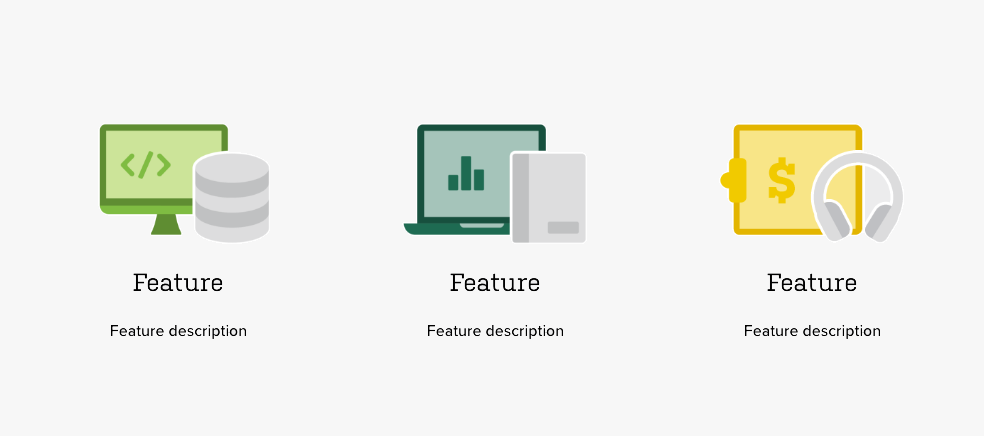
The features component is used to the top three features about a topic. They are displayed in three columns with only one row. Each item gets a primary illustration, title, and description. Do not add more than 3 items to this component.
The easiest way to create a new features component is to duplicate an existing one. However, if you need to create the component from scratch, follow the directions below.
# Creating features from scratch
This component is created in widgetkit. To create a new details component go to "Components" > "Widgetkit" and select "new". The follow these steps:
- Use the "Grid" widgetkit
- Add each item with a title and description
- Select an illustration for each item from the "primary illustrations" folder
- Go to Settings
In "Layout" use these settings
- Behavior: Match Height
- Gutter: Default
- Phone portrait: 1
- Phone landscape: Inherit
- Tablet: 3
- Desktop: Inherit
- Large screens: Inherit
- Panel: Blank
- Animation: None
In "Media" use these settings
- Show media: Yes
- Image width: Auto
- Image height: Auto
- Alignment: Above Title
- Border: None
- Overlay: None
- Animation: None
In "Content" use these settings
- Show title: Yes
- Show content: Yes
- Show social buttons: No
- Title size: Default
- Alignment: Center
- Show link: No
- Show badge: No
In "General" use these settings
- Link target: No
- HTML Class:
wk-features